It’s not a secret to anyone in the world that user experience is key to developing an app that people will use. And nowhere is this as crucial as when it comes to banking apps. In 2021, Money Summit reported that:
- 71% of bank customers favor a simple and easy digital experience over the friendly and helpful staff (isn’t that cool and weirdly surprising?)
- 33% of bank customers have quit using a mobile banking app if they’ve had a poor user experience
- 34% of bank customers have changed their financial service provider because of poor digital experience
Exchanging finances has to be an easy, convenient, and pleasant experience. Luckily, banks and financial institutions worldwide are starting to get that. Before 2020, banking apps were slowly becoming more popular but still a bit of an outsider among apps. It was taking time for large banks to admit that digitization is happening and user experience is at the core of it. COVID-19 changed that, accelerating the development of banking apps, and forcing more and more banks to digitize their services. With this, came more and more features made specifically for the convenience of the users. In the meantime, financial apps such as Revolut, iMX, and Venmo fueled the competition, designing better, cleaner, and more entertaining apps that showed how financial software could be digitized. They showed that financial transactions could be fun and easy. Now we’ve arrived at the time when financial institutions often do a great job creating apps that excel at UI/UX design. They are easy to navigate, intuitive, function on all possible platforms, and incorporate different exciting features.
Here are some of the best examples of UI/UX designs in today’s banking apps.
Citibank
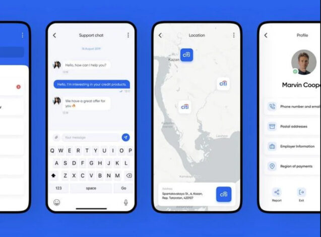
Citibank’s UI/UX design is clear and user-friendly. The style is minimalist and modern. The app’s UI allows for its multiple functions: you can work with cards, transactions, and operations. Filters make it easy for the user to specify the details and make sure they are not making any mistakes while performing financial operations. The in-app chat looks like a cooler version of Facebook’s messenger, and the Location feature has a map, which seems like a simple solution but is often ignored in banking apps.
Source: Behance
Alfa Bank
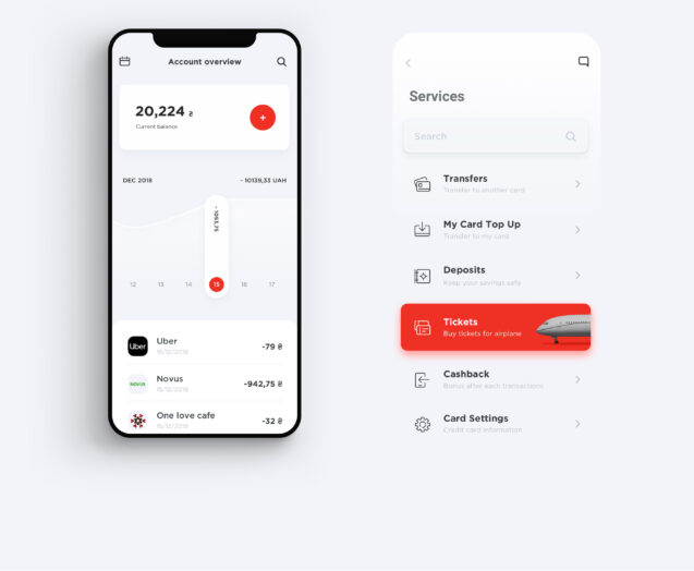
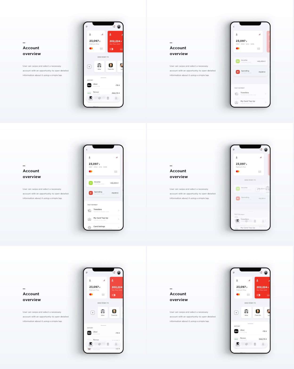
Russian Alfa Bank is one of the best examples of well-designed banking apps. It has easy-to-understand and intuitive options for all things finance. The colors are simple yet bold, and every screen is easy to navigate. The account overview has all the basic information and allows the user to swipe to select a necessary account and tap for them to see all the details.
Source: Behance
Cradle
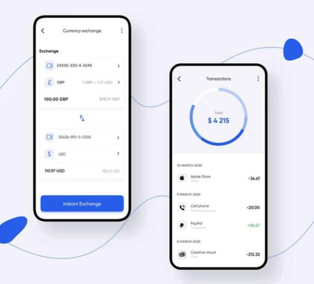
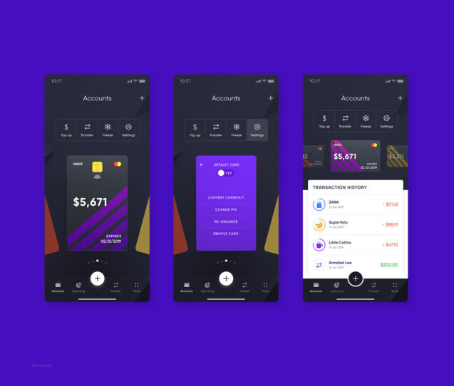
Cradle, a bank that allows you to create an account no matter where you’re from, has a bolder and more creative approach to design. The app boasts a range of colors, plays with geometry, and embraces neon. Each screen was created as a wireframe first and then embodied in the final visual design. All cards and accounts are in one place. You can swipe right and left to swap them. Your spendings are presented as pie charts with details that you can unfold below. The app gives you a clear understanding of how much you spend each month and what you spend the money on.
Source: Behance
However, often, banks don’t do that well when it comes to UI/UX design.
Multiple banking apps such as Bank of India’s app, People’s United Bank app, and HDFC Mobile banking app. All of them have common problems:
- confusing and unwelcoming UI
- slowness
- lack of crucial functionality
- overload of figures
- confusing error messages
It might be that they don’t put enough resources into UI/UX design or still underestimate the importance of user experience. We’ll never know. But for future banking apps, this article will offer some tips. These are necessary for a successful banking app and something the bank can request from their in-house team of designers or from the outsourcing agency they are hiring for developing their banking app.
-
Explain how the app works
The first thing you need to consider is short instructions for how the app works. Interestingly enough, they can come before or after the actual signup. You can nudge people to sign up for your banking app by giving instructions before the signup. But truth is, people are still probably interested in your app ― we all use banks and we all need an app to make the experience more convenient. A short guide for what can be done with the app can be in a form of a short video or intro slider that pops up after the user opens the app. Storytelling or interactive design can make this process more engaging!
-
Signup should be simple and secure
UI/UX is vital in the registration process: your users will have to share a lot of data with the app and go through multiple steps to ensure security. The task of every designer is to reduce the number of steps and make sure the process is as easy as possible.
-
Help users find ATMs and branches
The Location feature that shows where the nearby bank branches and ATMs are can be a lifesaver for the users. Your design should include a map (geo-location API such as Google Maps is perfect for that) and an “ATMs near me” feature.
-
Use flat navigation
For banking apps, it can be useful to have all the information in one interface. In this case, all the menus will be in one place and the users could go directly to the thing they want to do with one tap. This is achieved with the UI technique called flat menus or flat navigation, where users can find everything on one interface.
-
Switch texts for visual cues
People prefer imagery over texts. Symbols or pictures can often substitute texts, and the task of every UX/UI designer is to make that happen. Don’t make people read unless you really must! Having said that, it’s important not to overwhelm the users with multiple images and icons just as well and choose icons appropriate to actions. Often, concrete icons of different colors work best. A/B testing and multivariate is the way to go if you want to find out which icons and other forms of imagery work best for your banking app. All your imagery should be clear, concise, and accompanied by short text if necessary.
-
Mimic iOS/Android design patterns
Mimicking iOS design patterns and Android design patterns in your iOS and Android apps respectfully creates a sense of familiarity for the users. To make sure your app is intuitive and familiar, complete input fields, push notifications, header bars, menus, and other types of patterns to be consistent with the operating systems that your customers use.
-
Include transaction confirmations
Banking apps can make people nervous: users need to know what has happened, and where did the money go. This is why UI/UX guidelines for banking apps underline that the app should always ask users to confirm each step. Then, the app should reassure the users that the action has happened.
In conclusion
UI/UX design is based on five principles. These are functionality, reliability, usability, proficiency, and creativity. For banking apps and other financial software, these principles are just as important, if not more, as for the other types of applications. If you need to design an application that follows these main principles, is clear, intuitive, and speaks right to the user, contact Elinext for development costs.


